Wednesday 19 September 2012

London Fashion Week: Pam Hogg SS13

Carnage, chaos and elbows at dawn, the show hadn’t even started and already the buzz and drama surrounding Pam Hogg’s SS13 show was astounding. With a queue longer than that for a festival toilet, there were pushers, chancers and those who dropped out due to the wait and sheer magnitude of the crowd. However, for those will a little more stamina like (oh hello), I tolerated the army of Pam’s friends, family and celebrity followers let in before us to ensure I made the most of my seated ticket.

After much anticipation following her growing mainstream recognition, even recognised by national newspapers due to her recent wedding dress endeveours, Pam Hogg’s latest collection at Vauxhall Fashion Scout was greeted with sea of excited curiosity. With the despairing title, ‘Save Our Souls’, intrigue was at its peak as the lights plummeted the restless crowd into silence.

A single spot light revealed the first figure, sinister and writhing, barely concealed with a kind of bandage and brandishing two small flash lights in the pitch black. Here we go. SS13’s Save Our Souls display starts as it meant to go on, as the lights are poignantly reminiscent of distress signals, with the bandages and broken movement depicting the fragility of the soul in such a way that raised the hairs on our necks. As the lights return even brighter than before, a familiar face in the form of Alice Dellal appears, seemingly as a nurse with an expression dead behind the eyes.


Wearing a completely backless, white apron-dress; cuffed at the arms and composed in sheer fabric keeps the shock element in full swing. The following sequence of models sported outfits of a similar clinical style, adorned with statement zips and pins to provide a typical Pam edge over the comforting familiarity of a person in care.


Stepping away into classic designer territory, nurses are replaced with what I like to think of as Disco Space Babes. Bold flashes of pink and orange, blue and green are present on skin-tight lycra textures , laced with metallics geometric designs. High definition pops of colours were offset with space age thigh-highs, capes and skull caps, feeding into the alien nature.


Keeping things fresh, the collection entered its final trimester, replacing the extra terrestrial with intricate head pieces and bold formations; the soul coming full circle to embody strength. Grandiose ruffles and sequins married with pink tulle cuffs and constructions, again barely concealing the body but very much revealing the soul. As Alice Dellal took to the runway for her final look, a healthy round of applause sounded out for her ensemble – a black cage for a skirt complete with exposed ribbing and sheer fabric, complimenting head wear fanning out above her. Arms outwards possibly for effect and most definitely her own balance, she sashayed her way down to the end to provide the story’s conclusion.


Plunging into darkness once more, The Only One’s – Another Girl, Another Planet appropriately blared out as guests including Nick Cave, Bobby Gillespie and Fred Butler clapped their approval. Walking arm in arm with her majestic looks and delirious models, Pam Hogg delivered another out-of-this-world experience guaranteed to leave the audience clawing at the doors to get a look in next season. Expressive, inventive and almost poetic in its execution, you can guarantee I’ll be first in line.

And I was in the same room as Nick fucking Cave.

C. x

Monday 17 September 2012

London Fashion Week: Fashion Shenzhen SS13

So, what is Shenzhen when it’s at home? Well, home is China and it just so happens to be the country’s garment and textile capital. Hoping to also harness the title for creativity, the ambitious Shenzhen Garment Industry Association activated Fashion Shenzhen as a supreme platform for emerging talent. This season, two emerging designers are showcased in a bid to introduce them to the bustling London scene – AUM and Jixiangzhai (or Mascot to you and I, phew!).


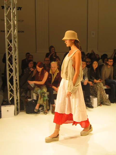
A monastic palette consisting of scarlet red and pale green married with mink and brown is layered loosely, one after the other. Slim leg trousers are skimmed by exaggerated dipped hem shirts; denim style shirt dresses brush the floor.  Striking a true balance, strong, structured pieces sit majestically over simple, high finish fabrics to bring a certain harmony to each look, in keeping with the ethical mindset. Finished with woven brown hats with graduating brims, the relaxed Buddhist element runs from top to toe as the models gracefully parade in woven flatform slingbacks in neutral tones. The collection was minimal and relaxed, a stark contrast to what was to follow.


Mascot has already established itself as a known  brand in China, with 90 stores to its name across the country. Undenying of its heritage,  the Orient was of fundamental importance to this showcase. High button collars and traditional styles brought with them pops of vibrant pink and lime greens; followed by an elegant bold orange dress, elegantly falling to the floor in a train. Gold embellishment to the neck turned into oriental threads,  as a trio of crushed blue velvet looks look to the floor. As Lucy excitedly pointed out the meaning behind the pattern (water as it so happens…), the lengths ranged from sophisticated gowns to strapless minis, all complimented by slicked hair, tucked into a bun. From cowl necks to woven waistcoats, the detail was somewhat tremendous in parts complimenting the simple, feminine silhouettes and curved lines.


The only weird bit about the show was the Chinese tourism video they played in the interval. No, really. Even if no one can afford the plane fares, the two designers brought a wee taste of the Orient to the city. 
Not particularly my cup of tea mind you...

C. x

Sunday 16 September 2012

London Fashion Week: Melissa Diamantidi SS13

Gathering in the Vauxhall Fashion Scout Freemason’s Hall, sat behind the designer Melissa Diamantidi’s eager and excited mother, I had my fingers crossed that her collection would truly deliver a display to make her mother proud.


 This season, Diamantidi set out explore the power of light by using an array of sheer fabrics to challenge our perceptions and create a range that juxtaposes fragility with strong, structured designs. Lightweight silks and organza are formed into structured cropped tops, layered over gorgeous black and white fanned skirt dresses or waterfall jackets. The collection was startling in its, for want of a better word, prettiness. The simple three colours of black, white and mint green were all that was needed as strapless mint prom dresses were complimented by  strong yet sheer white capes, with beautifully formed and effortlessly powerful black dresses, abstractly layered, left to their own devises.  Abstract angles sat upon willowy frames to both compliment and contrast this sense of the frail and the strong, playing with the light in masterful way.  The selection of silks and reflective materials only served to re-enforce the abstract and altered perception of light the designer so hoped to achieve. Whilst the collection was undeniably elegant in its femininity, quilted panels and subtle zip details provided a certain edge to leave the pieces wholly balanced and breathtakingly beautiful.


Slicks of metallic green to the eyes were visually stunning as make up remained minimal, hair tied into wispy low, side buns. Accompanying each look, patent black loafers suggested that flats were here to stay for another season whether it be with pretty sundresses or formalwear.


Sure, the collection may have lacked the prints and explosive accessories of other designers seeking to make an impact yet Melissa created something strangely innocent and extremely clever. Using only 3 colours and the same pair of flats throughout, the collection was gorgeous in its seeming simplicity. However, when you look beneath the surface, the structures and materials are so intelligent you have to sit up and notice.


As her mother wiped a tear from her eye and I left dreaming of white dresses and Spring, you could probably say the collection was a bit of a hit. Well, for me and her mum anyway.

C. x

London Fashion Week: Jasper Garvida SS13

After one of those journeys that seems to be to the centre of the Earth (no thanks to my seriously battered feet) but in reality is exceptionally simple, I eventually found my way to the Bloomsbury Hotel for Jasper Garvida’s latest showcase. Who's Jack have been fans of Garvida for some time now and we were rewarded with a VIP ticket for a really great close up look at L’Unite de Temps et L’Espace, his SS13 collection.


 Oh yes, I was on the FROW - goodie bag and ego boost galore.

As  the sweet sounds of Dusty Springfield  ring out, we are given a hint into the inspirations behind the collection – the 1960’s of course. However, before we had time to contemplate, a bizarre noise hit our ears as the first model took the walk. As she paraded by in a gorgeous all black shift dress in a mini length, it became apparent that the noise was the brushing together of oversized shimmering discs layered upon her skirt. From the length to the very basics of the first look, you could tell that the collection would take shape around the styling of iconic figures such as Mary Quant and draw inspiration from the times as a whole.


 An almost abstract leopard print is accessorized with flip up sunglasses in a circle design and a simple plastic cuff, moving onto geometric designs in black, white, silver and beige. The combination of geometry and structure, right down the very hairstyles inspired by Vidal Sassoon, reflect the modernist architectural design of the time, brought to us in a very 21st century way. Perspex geometric chokers immediately grab my attention, swamping the models delicate frame with a bold structure to create a simple yet effective contrast.  Colour blocked striped dresses are ready to wear, perfect for casual city chic whilst optical monochrome sequin dresses and shimmering cream lace and disc shifts are perfect for after dark.


The collection very titles draws upon the unity of time and space, the contrast of light and dark, which is something that cannot be dismissed. Strong shapes fit upon soft and feminine silhouettes, simple two tone patterns compliment structured tailoring to create a perfectly balanced collection. As I sat there with my beehive and turtle neck (oh yes, I went there), I was immediately drawn to the wearability of the works and ridiculously excited by the prospect of potentially being able to wear a dress that can be heard before it is seen.  It’s the simple things.


 C. x

London Fashion Week: DAKS SS13

Bright and early on day two of London Fashion Week, and still exhausted from the bustling schedule from the day before, I managed to drag my weary bones from bed to BFC for the DAKS SS13 collection. The first show of the day usually lacks in numbers due to the hangovers and inability to wake before 7am yet DAKS manages to pull in a packed out crowd with familiar Made in Chelsea faces banished to (shock horror) the 3rd row.

http://whosjack.wpengine.netdna-cdn.com/wp-content/uploads/2012/09/IMG00607-20120915-0919.jpg

Soundtracked by a song from The Knife’s Deep Cuts, the abstract beat provides a perfect backdrop to a collection inspired by Expressionist art, from cross-hatched surface techniques to layered brush strokes.  As it so happens, layering performed a key part in the range with models cocooned in oversized proportions and floating chiffon fabrics, a nod to the fluidity of the movement.

http://whosjack.wpengine.netdna-cdn.com/wp-content/uploads/2012/09/IMG00606-20120915-0919.jpg
Springtime at DAKS saw a gorgeous neutral palette with rich dusty tones washed with white and covered in earth.  In a tale of two halves, the collection moves from light to dark with simple, clean cut shift dresses under boxy leather sleeveless jackets  alongside exaggerated semi-sheer sleeves and wide leg trousers. As the collection progresses towards the solstice, the days become lighter and with it comes warm orange brown tailored shorts with romantic dark cream shirts and bell sleeve metallics.  Sheer white and cream cool lead the way for simple, chic city looks in structured layers, finished with tiny shoulder bags and small gym bags carried at the calf. And finally, the Pièce de résistance, a soft brown heritage tweed cape with black piping to the pockets and collar leaves the audience counting down the days until release. Paired with simple tan flats with cut away sides, I realise it bears a resemblance to the beige tweed 1960s cape I wore yesterday which officially means they stole the idea from me (right?).

The effortlessly refined collection was finished to perfection with slender pony tails that reflect the simple sophistication of the brand.  As the models took for their final lap of honour, the reality of the collection really becomes apparent as solid looks are followed to a consistently high standard to create a truly ‘complete’ collection. I want it all and I want it now.

http://whosjack.wpengine.netdna-cdn.com/wp-content/uploads/2012/09/IMG00604-20120915-0919.jpg

http://whosjack.wpengine.netdna-cdn.com/wp-content/uploads/2012/09/IMG00598-20120915-0917.jpg

http://whosjack.wpengine.netdna-cdn.com/wp-content/uploads/2012/09/IMG00613-20120915-0921.jpg
C. x

London Fashion Week: Zeynep Tosun SS13

Presenting in the spectacular Vauxhall Fashion Scout’s Freemason’s Hall, I managed to drag my weary bones from Somerset House for a highly anticipated collection from Zeynep Tosun. Well, with Faye declaring “that’ll be well good” first thing this morning, you can see where my excitement has come from.

http://whosjack.wpengine.netdna-cdn.com/wp-content/uploads/2012/09/zeynep2.jpg

But in all seriousness, Zeynep Tosun’s collection really is something to be excited about. With a career that began with Alberta Ferreti in 2006 leading right up until last season with her House of Evolution showcase, Tosun has both the knowledge of experience and youthful brand development that makes for an intriguing collection. Having covered House of Evolution myself last season, Tosun’s brand identity is recognisable yet increasingly innovative. With Autumn’s burgundy hues, prints and metallic eyes all cementing themselves as key season details this year, I have a good feeling that Tosun has an eye for detail and an understanding of what’s to come. Now I’m excited.

But in all seriousness, Zeynep Tosun’s collection really is something to be excited about. With a career that began with Alberta Ferreti in 2006 leading right up until last season with her House of Evolution showcase, Tosun has both the knowledge of experience and youthful brand development that makes for an intriguing collection. Having covered House of Evolution myself last season, Tosun’s brand identity is recognisable yet increasingly innovative. With Autumn’s burgundy hues, prints and metallic eyes all cementing themselves as key season details this year, I have a good feeling that Tosun has an eye for detail and an understanding of what’s to come. Now I’m excited.

http://whosjack.wpengine.netdna-cdn.com/wp-content/uploads/2012/09/zeynep1.jpg

Dominated by the European and Asian influences of Istanbul, her birthplace,   her collections are generally characterized by high expressiveness and many contrasts, be that in material, colour, texture or style. This eclectic mix is no exception  this season in a collection that boasts floaty chiffon desert cool in perfect unison romantic sheers,  stark monochrome and gorgeously intricate prints. With so many clashing elements fused into one display, you’re lucky not to end up with a hot mess. However Zeynup, in her unique way, pulls it off.
Kick starting proceedings with Equestrian inspired caps and quilted white jackets, strapped at the neck, there is an immediate contrast between bondage and beauty as a clean, feminine cut is given a  tough yet sophisticated grunge edge. Inspired by our recent Olympic success perhaps? No, probably not.  However the sporting theme continues as luxe racer fronts and metallic side-stripe trousers merge into more characteristically Springtime florals yet, as is the way it should be, there is something fresh about the design.  Intricately weaving themselves up the body, flowers depart from the legs to entwine with the body. With crisp whites accentuated by mint greens and lilacs, soon comes the golden sands of the desert as pieces take a new direction.  Hoods turn to hats and outfits are topped off with oodles of chunky silver in the form of chokers, a signature metal it seems for the designer.  This truly is a collection of many dimensions.

http://whosjack.wpengine.netdna-cdn.com/wp-content/uploads/2012/09/zeynep3.jpg

All in all, after an array of metallics and prints, contrasting cuts and imaginative accessories, I suppose there’s only one way to describe the works. Yes Faye, it was well good.

C. x

London Fashion Week: Heohwan Simulation SS13

Showcasing at last season’s Ones To Watch and this season’s recipient of the Merit Award, the experimental Heohwan Simulation has more than proven his worth with a myriad structured transisitional pieces. Yes, that’s right – someone has finally realised that Spring doesn’t automatically assume the form of sunny skies and blistering heat.


Whereas other designers see SS collections as the go-ahead for thigh skimming shorts and crop tops galore, Heohwan brings a masculine edge to summer-time cuts that results in a perfectly wearable and versatile collection. Originally studying menswear at the highly esteemed Royal College of Art in 2007 and launching his womenswear label in 2010, his foundations in menswear only adds to the intrigue of his work. The female silhouette is overcome with boyish shapes, contrasted with oversized yet loose belts and sheer fabrics to create a new kind of femininity. Undenibly gorgeous yet grasping at a gentlemanly charm,  it is the connection between the two extremes that creates harmony.


Whereas other designers see SS collections as the go-ahead for thigh skimming shorts and crop tops galore, Heohwan brings a masculine edge to summer-time cuts that results in a perfectly wearable and versatile collection. Originally studying menswear at the highly esteemed Royal College of Art in 2007 and launching his womenswear label in 2010, his foundations in menswear only adds to the intrigue of his work. The female silhouette is overcome with boyish shapes, contrasted with oversized yet loose belts and sheer fabrics to create a new kind of femininity. Undenibly gorgeous yet grasping at a gentlemanly charm,  it is the connection between the two extremes that creates harmony.


Citing the literary work of Naomi Klein as the inspiration behind the designer’s latest spectacular, with the idea of hidden logos and factory workers as the concept of minimalism, the collection is clean cut and simple yet wholly intelligent. First along the runway, instantly defying the notions of what a catwalk should be, come two models at once; as identical as the other. Oh yes, I’m talking twins. Eerie and effortless, the girls ooze a muted sense of cool in pale chiffon and interlocking fabrics. With an injection of perforated leather and silver embellishment most associated with AW, the collection marries both aggression and delicacy.
Whilst woolen cropped jackets and mesh provide a tough element, umistakeable hues of green and yellow break out like crocuses from the ground to remind us that the sun may be (or, as the case may be, not) on its way. Layer chiffon shirts and urban prints entwine with structure and the geometric to create a range of conceptual urbanwear, most deserving of the Merit prize.


Minimalist and engaging, this is the collection that could find a connection with almost any personal style. Fresh whites and colour pop appeal to the girliest amongst us but exist in such a form as to attract the attention of those who prefer a little subtley and edge. Heohwan Simulation goes to show that Spring and Summer don’t have to be a dramatic departure in the direction of pastels and hotpants but a perfect progression that could survive wardrobe banishment come Autumn. Not half bad.

C. x